Roviza
-
A cross-media visual identity project for a very extrovert brand of screws.
This project was developed as main output for the final course of my Bachelor Degree in Communication
Design at Politecnico di Milano. The brief was to develop a visual identity, a marketing
campaign and an interactive installation for a brand built around an object that is usually
brand-less, like a screw.
We conceived the Roviza brand in opposition to its real counterparts in the DIY market:
creative, irreverent and absurd. With these premises, the only possible installation
that could suit Roviza's style was a fighting arcade game.
I took care of the ideation of the brand, the design of the visual identity,
and the design and development of the game.
My project teammates were
Sara Lavazza, Elena Filippi, Matteo Maggi and Pasquale Morelli.
Visual inspiration
-
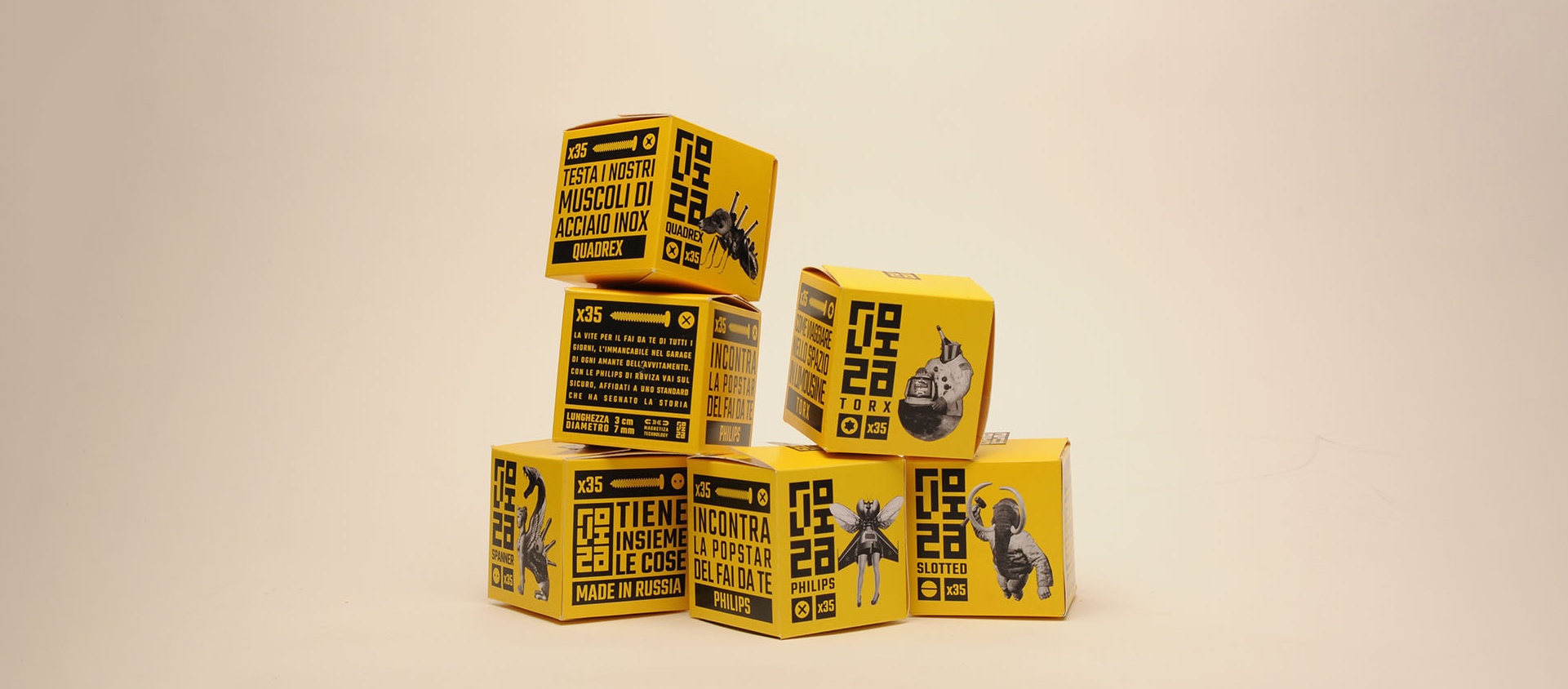
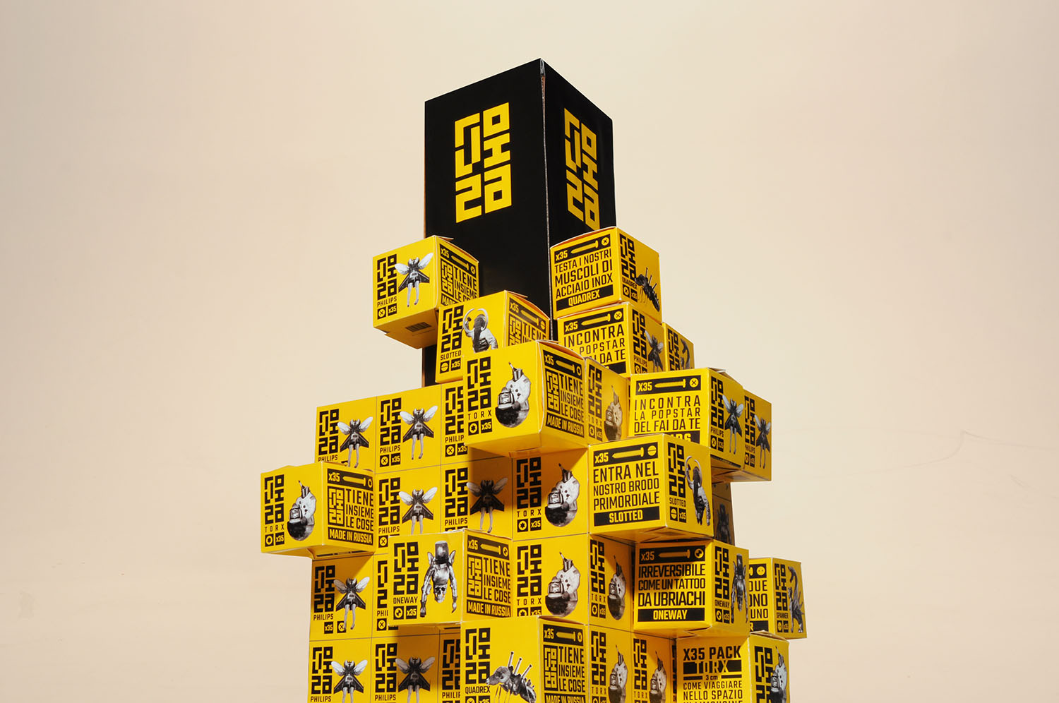
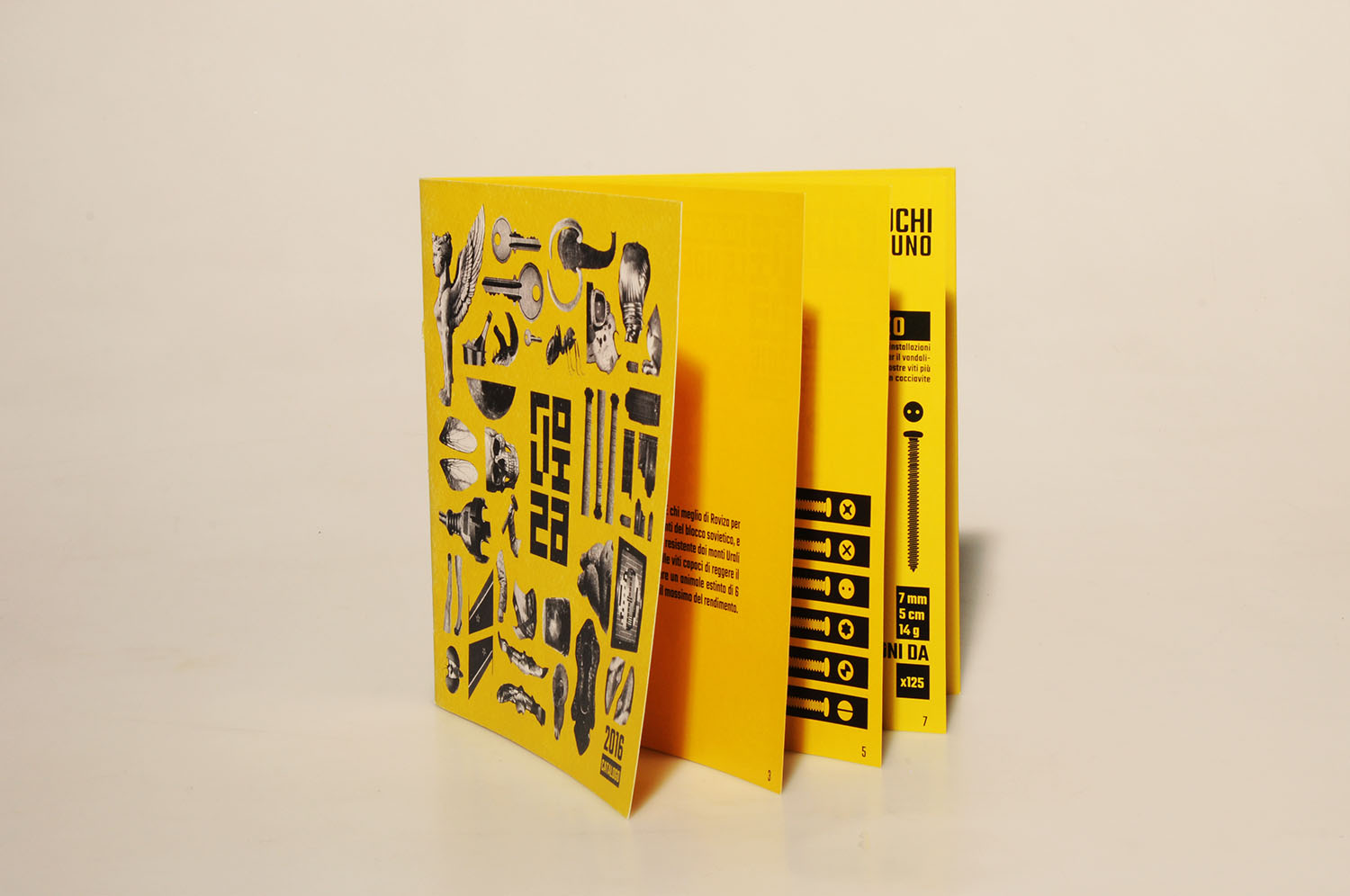
Roviza's logo and the layout for the packaging was inspired by Russian
constructivist architecture and design.
This source of inspiration is even more evident in the
exhibitor, where single packages of screws can be attached to a central
pillar to create a shape-shifting structure.
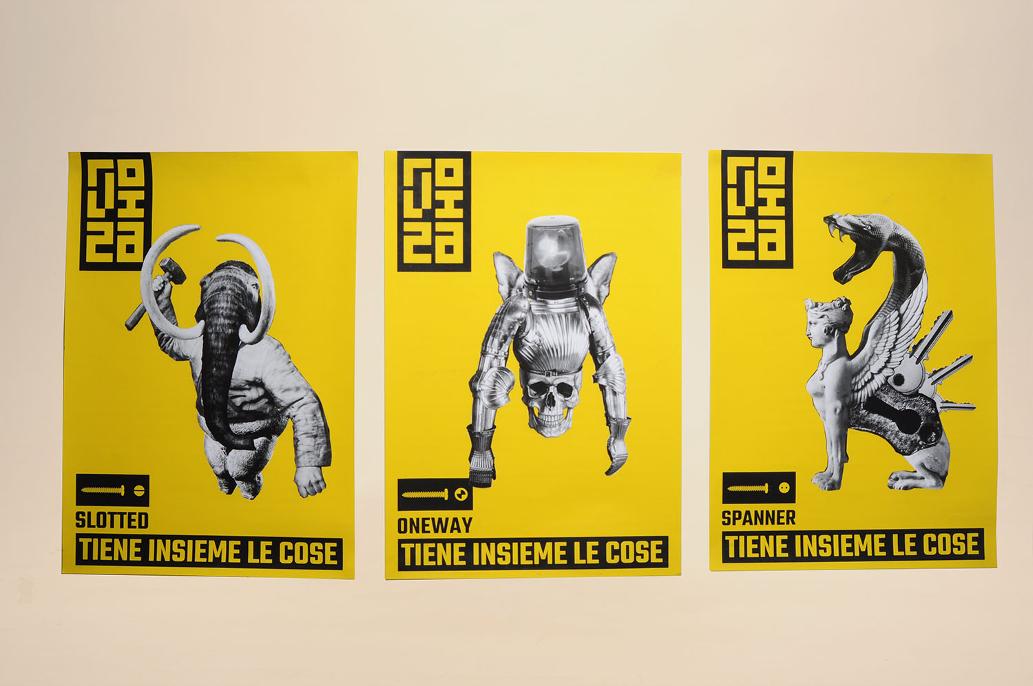
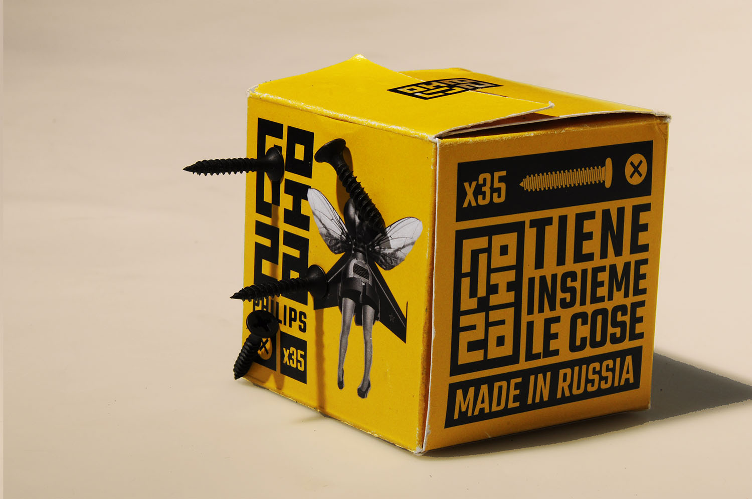
Roviza's mascots
-
Roviza manufactured a lot of different screws, some very popular, some more niche.
In order to help DIY lovers to differentiate between the different types of screw heads,
we created a mascot for each product of the brand.
Living up to Roviza's motto "Keeps things together", these creatures are
agglomerates of elements coming from different contexts, coming alive.
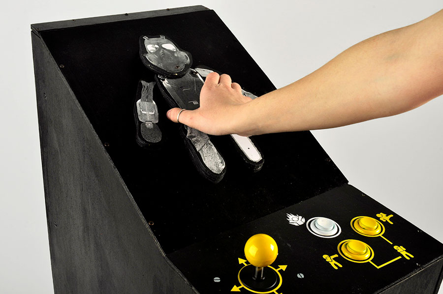
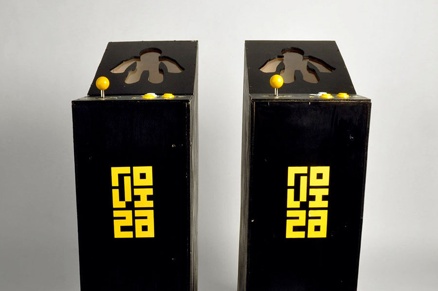
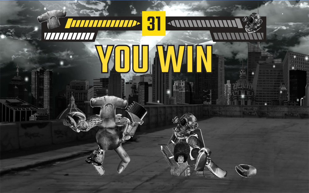
Screw the Fighter
-
The interactive installation we designed and developed for the brand featured
a peculiar kind of arcade cabinet. Visitors could put together their own fighters
as wooden puppets, using Roviza screws to combine the different, absurd body parts available.
The cabinet would then scan the puppet and players would be able to see their creation on the screen
and to play with them in a 1 VS 1 fighting challenge.